Digital design has never stood still, and the shift from flat aesthetics to something richer has reshaped how brands speak to their audiences online. For any business investing in a website or app, understanding this progression is not simply an aesthetic curiosity but a practical necessity for reaching customers effectively across screens.
Key takeaways
- Flat Design gained popularity for its minimalist aesthetic and mobile-friendly speed, but it often created usability issues by making it difficult for users to distinguish clickable elements.
- Google’s Material Design evolved from Flat Design by adding depth, shadows, and layers to provide intuitive visual cues and structure for digital interfaces.
- The consistent design language of Material Design helps businesses maintain a coherent brand identity across various platforms and devices, which is essential for building user trust.
- Functional animations in Material Design serve to guide user attention and provide immediate feedback, helping to improve conversion rates and engagement.
- Material Design provides a standardized component library that accelerates development time and ensures accessibility, making it highly valuable for organizations undergoing digital transformation.
- The principles of clarity, hierarchy, and purposeful motion inherent in Material Design are increasingly used to strengthen the effectiveness of social media advertising and marketing campaigns.
The Evolution from Flat Design to Material Design in Digital Interfaces
Understanding the Core Principles of Flat Design and Its Impact on User Experience
Flat Design emerged as a reaction against the ornate, glossy interfaces of the early web, favouring clean space, bright colours and two-dimensional graphics over needless embellishment. Its appeal lies in simplicity, and companies such as Dropbox, Airbnb and Pinterest embraced it early on precisely because it stripped away distraction and let content take centre stage. This minimalist approach improved loading times and made interfaces feel light and modern, which suited the growing demand for mobile-friendly browsing. However, the same simplicity that made Flat Design so popular also introduced usability concerns, since users sometimes struggled to distinguish clickable elements from static ones, and brands found it harder to convey a distinctive personality when everything looked so pared back.

Material Design’s Introduction of Depth, Shadow, and Visual Realism to Modern Interfaces
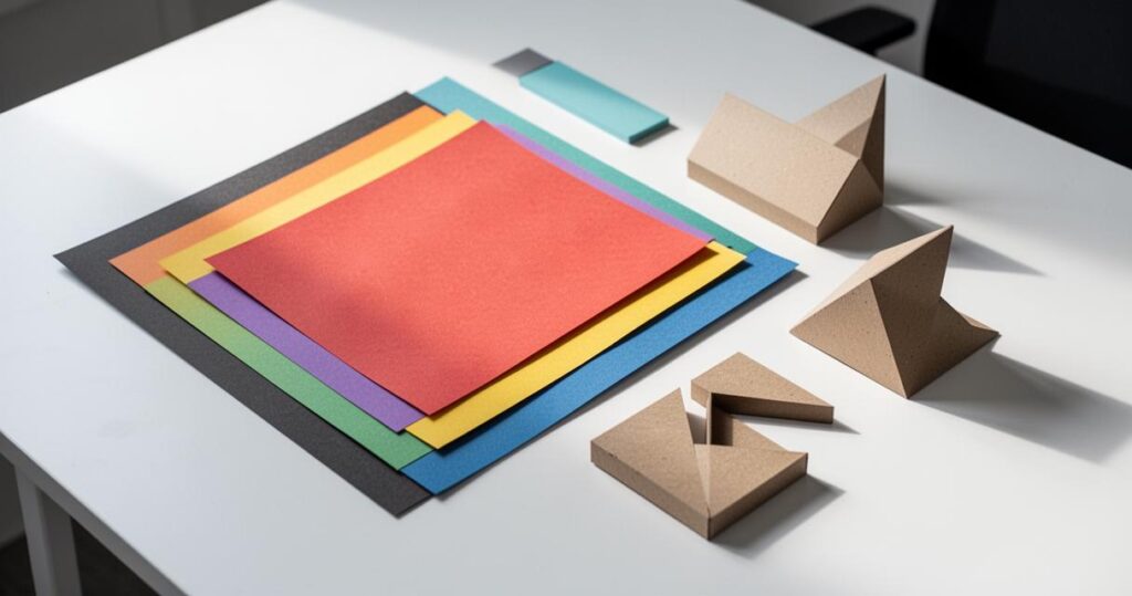
When Google introduced Material Design in the summer of 2014, it was widely seen as a thoughtful response to those shortcomings. Rather than abandoning the minimalist foundation, it built upon it by adding depth and shadow, giving digital surfaces a sense of physicality that helped users understand hierarchy and interaction more intuitively. Applications like Google Drive, Evernote and Trello adopted this language, using subtle shadows and layered surfaces to suggest which elements could be tapped, dragged or expanded. This visual realism, inspired by ink and paper, gave designers a consistent set of rules to follow, and it is this consistency that has made Material Design a lasting reference point rather than a passing trend among serious digital graphic design practitioners.
How material design principles enhance business communication and marketing effectiveness
Responsive Design and Cross-Platform Consistency in Brand Identity and User Engagement
For marketers, the true value of Material Design lies in its unwavering commitment to responsiveness. A well-built interface must behave predictably whether viewed on a smartphone, tablet or desktop, and Google’s guidelines were built specifically to ensure that brand identity remains coherent across every device compatibility scenario. This matters enormously for businesses trying to maintain trust with their audience, because inconsistent experiences can quickly erode confidence in a brand. Companies operating in sectors such as financial services and healthcare, where credibility is paramount, often lean towards Material Design’s structured approach precisely because it signals professionalism and care in equal measure.
The Role of Animation and Interactive Elements in Driving Conversions and User Retention
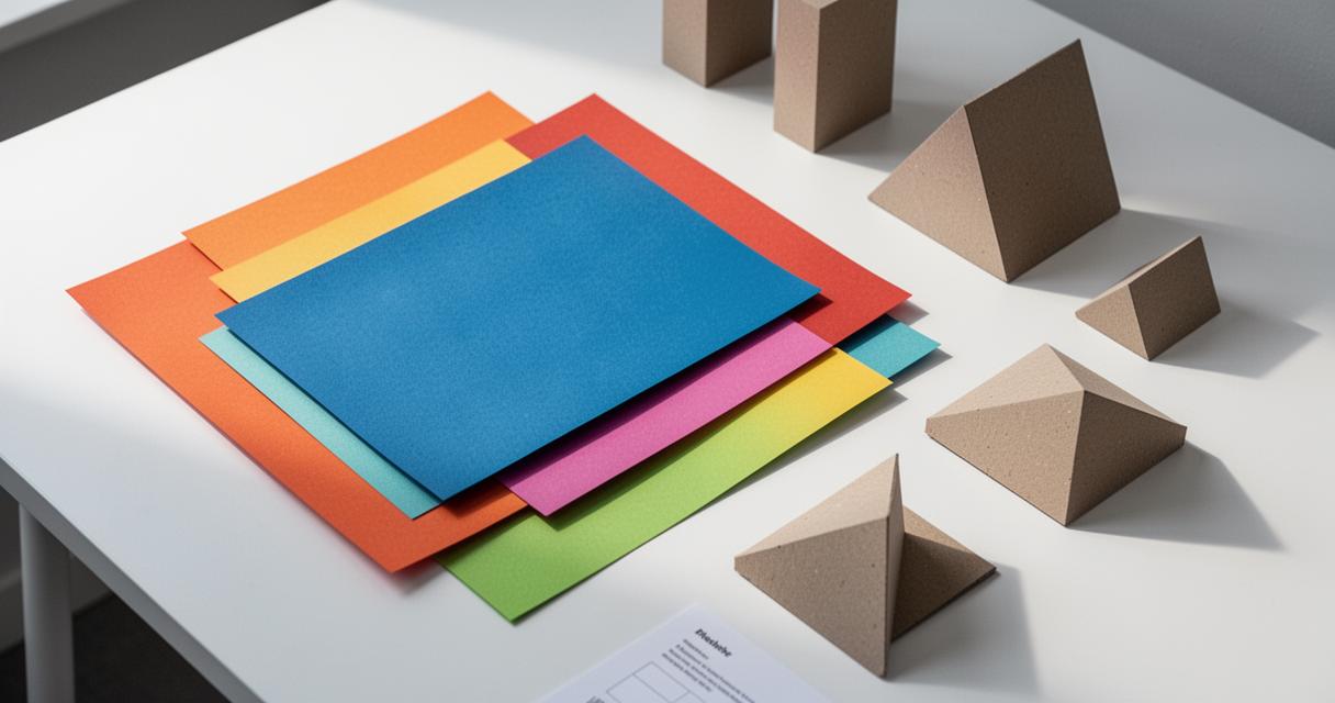
Animations are not mere decoration within Material Design; they serve a functional purpose by guiding attention and confirming actions, which in turn supports better conversion rates. When a button subtly ripples on touch or a card smoothly expands to reveal further detail, users receive immediate feedback that their action has registered, reducing hesitation and confusion. This kind of interactivity can be a genuine asset in marketing campaigns, where every second of engagement counts. That said, these animated flourishes come with a cost, as they can increase battery consumption and occasionally slow performance on older devices, a trade-off that designers must weigh carefully against the benefits of a more expressive interface.
Implementing material design across mobile applications and social media platforms
Optimising mobile user experience through material design components and guidelines
Mobile applications benefit enormously from the structured component library that Material Design provides, offering ready-made patterns for navigation, buttons and cards that reduce development time while maintaining usability. This is particularly relevant for organisations undergoing digital transformation, where software development teams are frequently tasked with building web, mobile and cloud applications simultaneously. Having a shared design vocabulary speeds up collaboration between designers and developers, and it also supports accessibility, since Material Design’s guidelines include considerations for contrast, touch target size and inclusive design that benefit users with varying abilities. As technologies such as artificial intelligence, the Internet of Things and even early forms of virtual reality and augmented reality begin to influence interface design, having a flexible yet consistent foundation becomes even more valuable.
Leveraging Material Design Aesthetics for Social Network Advertising and Digital Marketing Campaigns
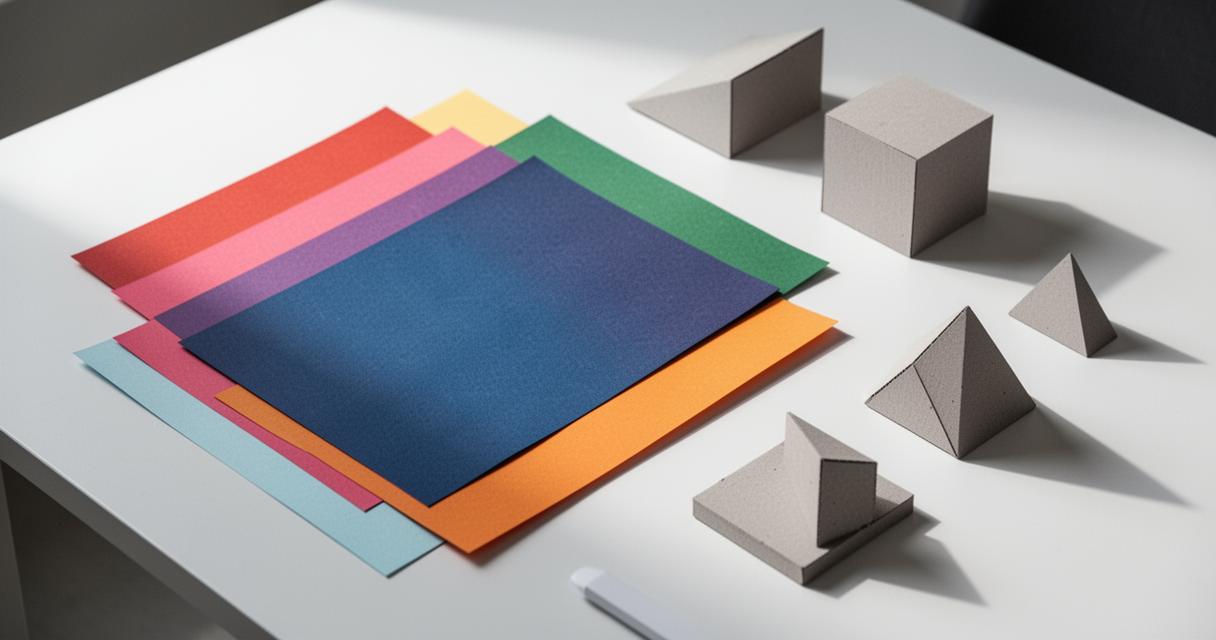
Social media platforms and advertising networks increasingly favour visual consistency, and Material Design’s emphasis on clear typography, deliberate colour choices and layered imagery translates well into advertising creative. Marketers crafting campaigns for social networks often find that the same principles guiding app interfaces, namely clarity, hierarchy and purposeful motion, also strengthen the performance of paid adverts and organic posts alike. It is worth noting that platforms like LinkedIn rely on cookies to deliver their services and tailor advertising, and users are typically asked to accept or reject non-essential cookies while agreeing to a user agreement, privacy policy and cookie policy before joining or signing in, which reflects the broader industry trend towards transparency in data use alongside visual design.
Deciding between Flat Design and Material Design ultimately depends on a project’s specific goals, its intended audience and any technical constraints at play. Flat Design remains attractive for teams prioritising speed and understated elegance, while Material Design suits those wanting richer interactivity and cross-device harmony, even if it demands more from personalisation given its ownership by Google. As emerging technologies continue to influence how people interact with screens, the strongest digital strategies will be those that adapt thoughtfully, keeping user experience and genuine usability firmly at the centre of every decision.